Client
Beyond Water, India
Services
Brand Design, Identity, Packaging
Year
2020
Health, Hydration and Convenience!
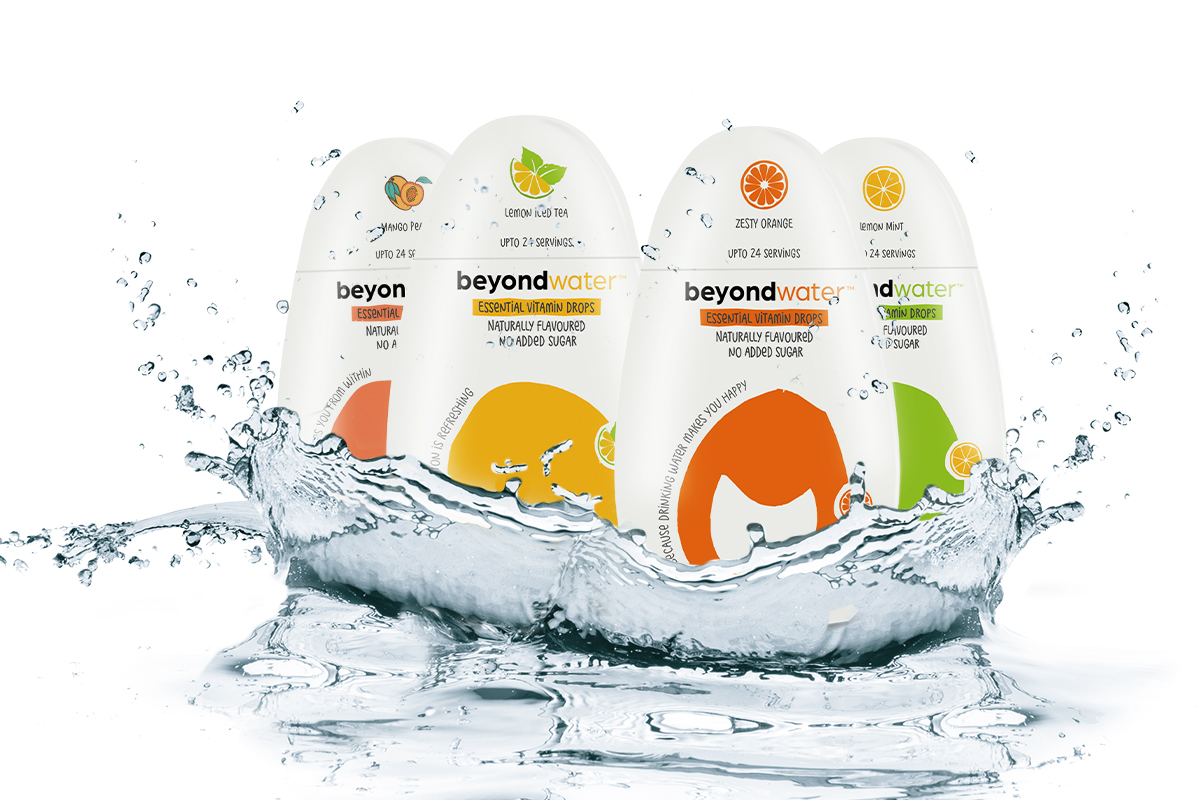
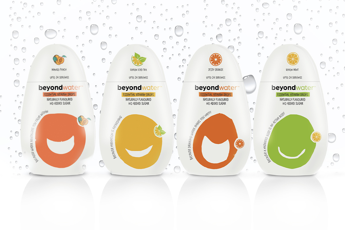
Beyond is an expression of what we stand for. Going beyond the ordinary. Going beyond means taking a leap and going that extra mile. Beyond stands for an elevation that constantly goes further, ALWAYS. We are in an endeavour to go beyond our limit every new day. The logo brings about an effortless visual appeal. The idea was to keep it as minimal, free and simple as the spirit of water.
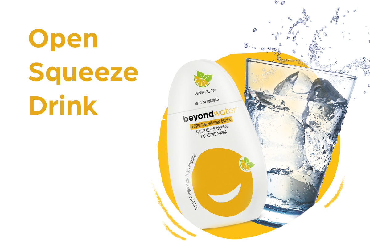
The smilies are the primary illustrations which are used on the front panel of our bottles, to portray modern, expressive, vibrant and trendy. Formation of these smilies is organic to represent the nature of the brand fused with the playful illustrations of the fruits that cue in the flavour.


